AGORA
identity
PRODUCT DESIGN
Summary
How to provide a cohesive visual language for a digital learning solution within a world-class company ?
This was the challenge for "Agora", a platform developed across multiple business lines with their own particular needs.
Deliverables
Identity system
Brand strategy
User interface
Product design
Dates
2022-2024
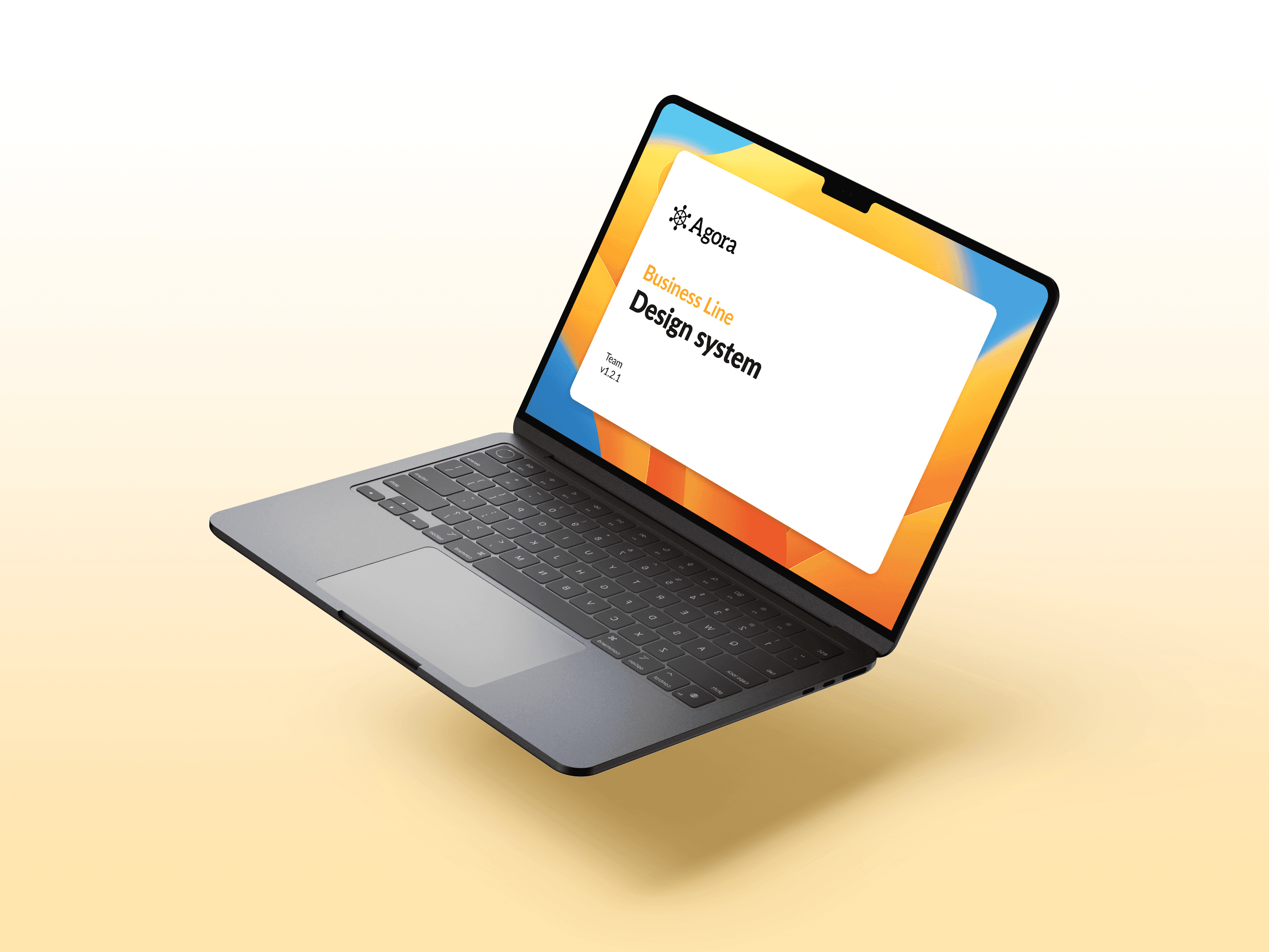
Due to security and confidentiality concerns, the original name, logotype and content of the project study have been modified.
Design fundamentals
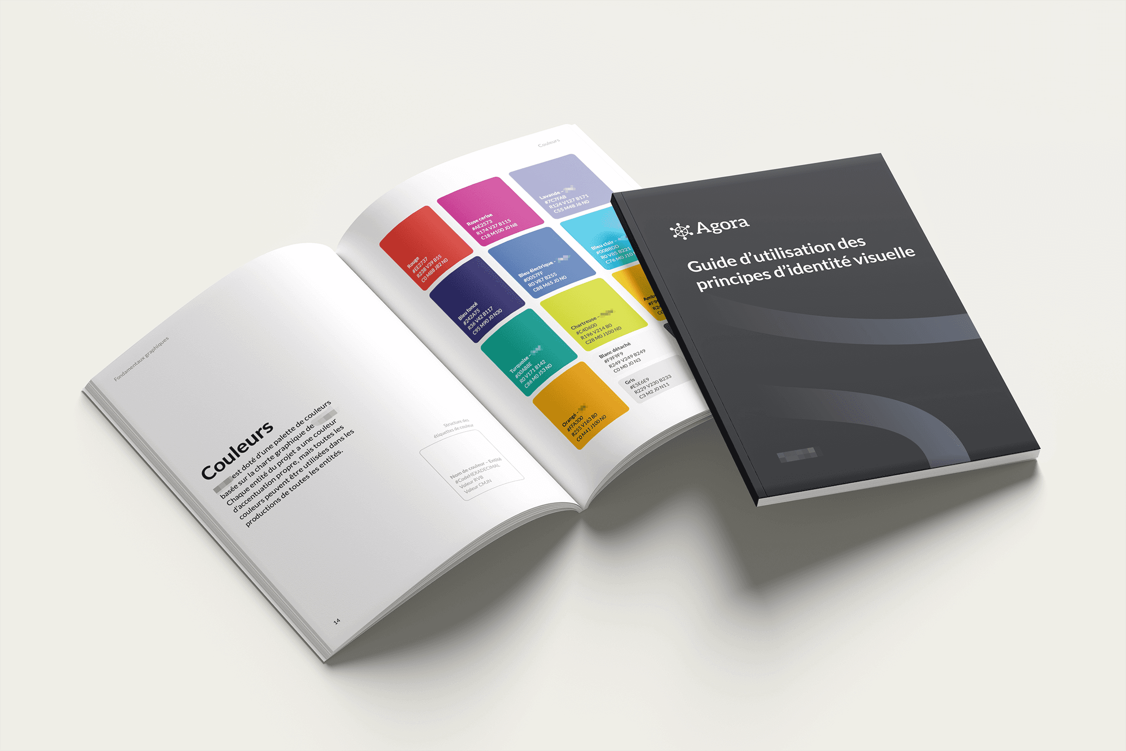

Typefaces

User interface design
A versatile design system has been designed for the development of a digital learning portal. Simple and modular, the use of accent colour is business line specific and makes the Agora identity recognisable within the company. In the next examples, the business line's accent colour is orange.

Cards and buttons
The card and button design showcases the design system's modular and user-friendly design philosophy.


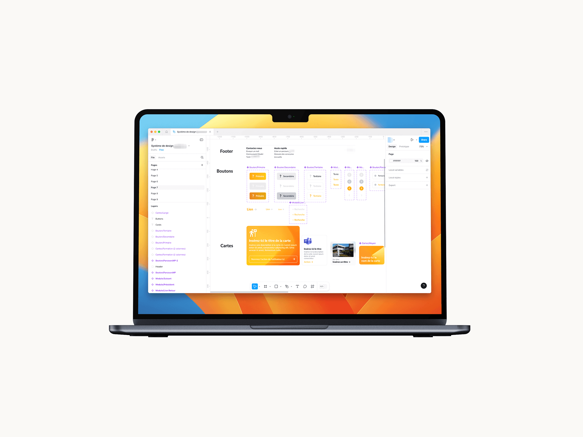

Icons
Google's Material Icon suite allows for a consistent style across the interfaces.
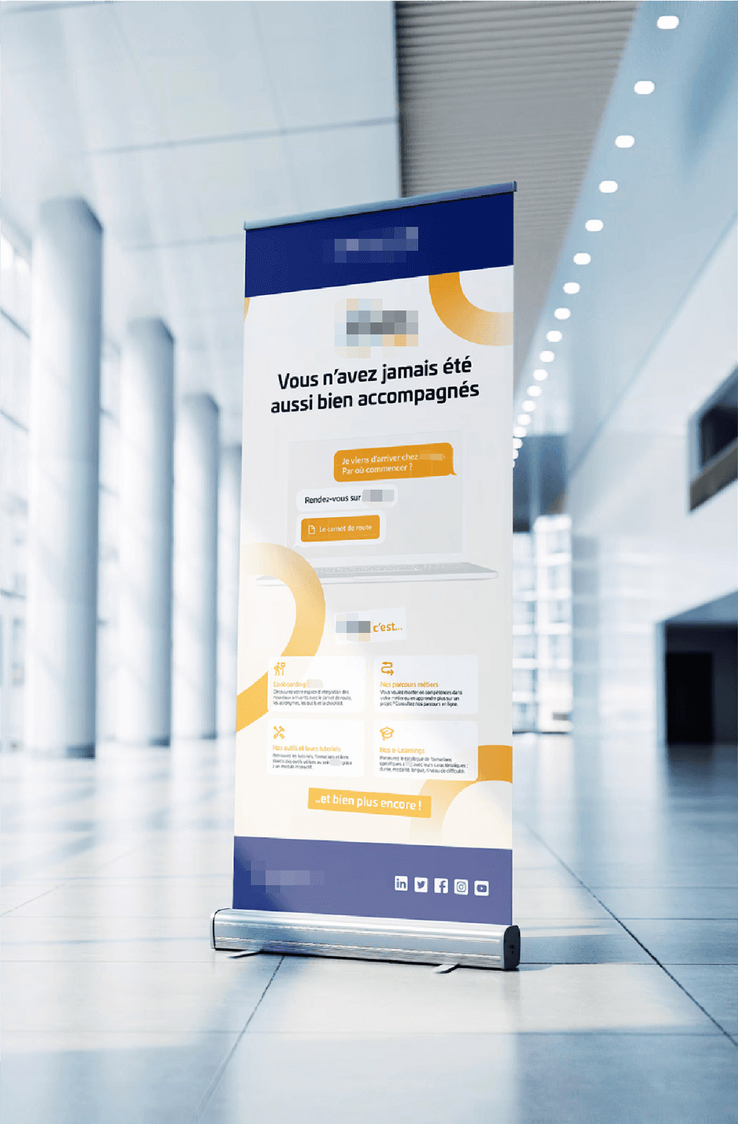
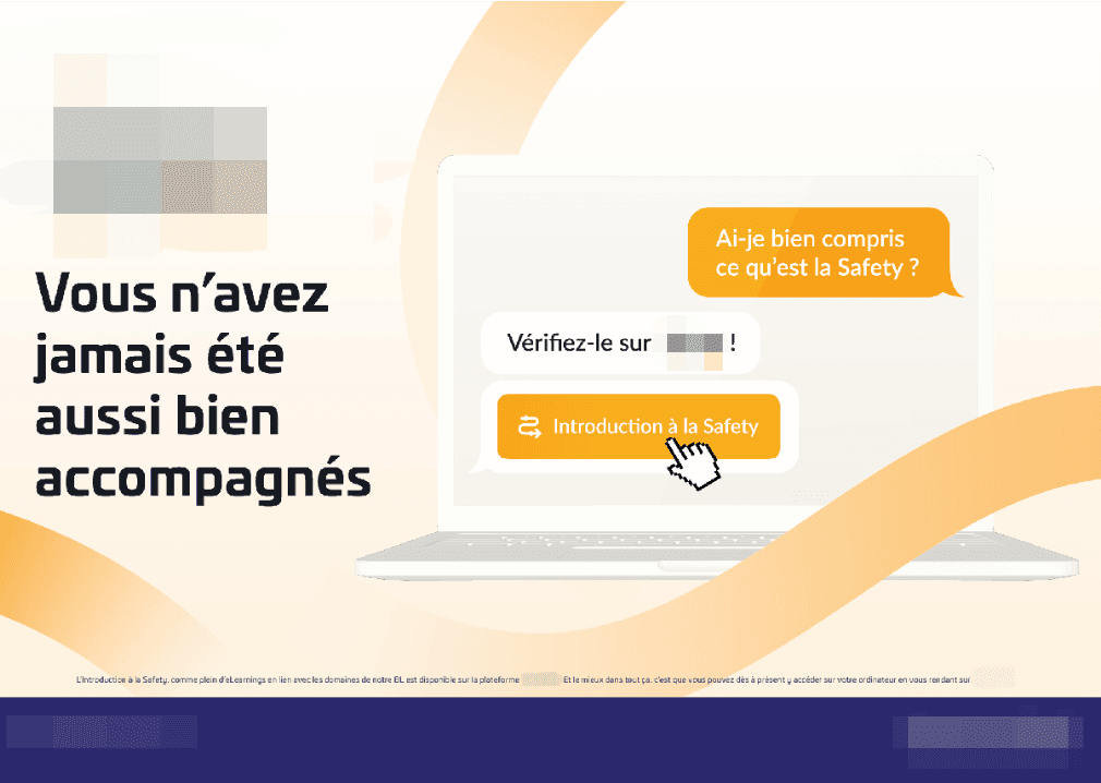
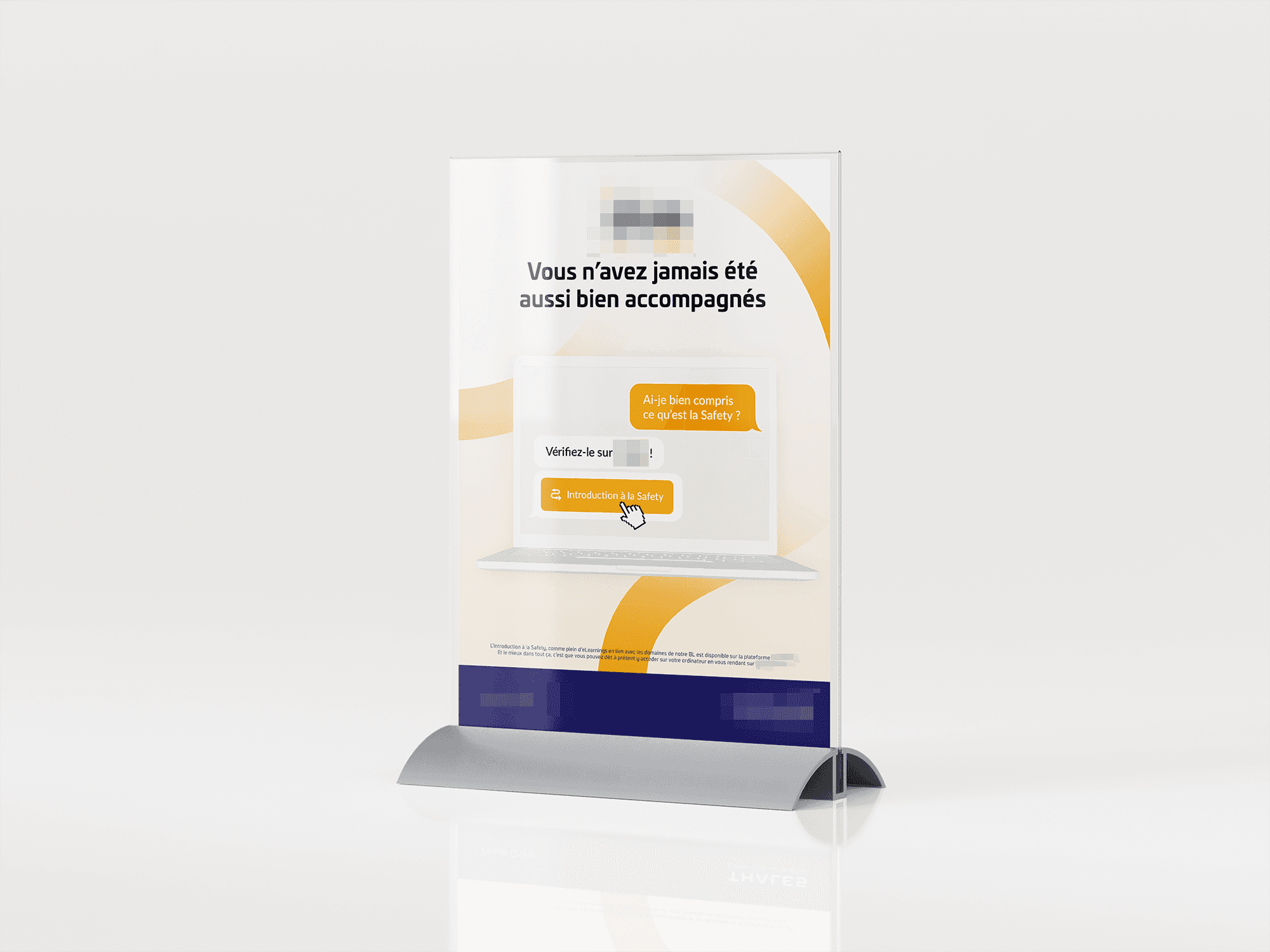
Advertising campaign
Every project needs to define its image and promote itself to the public. In-house initiatives are no different. The communication tone and visual language have been thought of as a system for both digital and print formats. This time, the original logotype has been blurred out to preserve the layout of the posters.